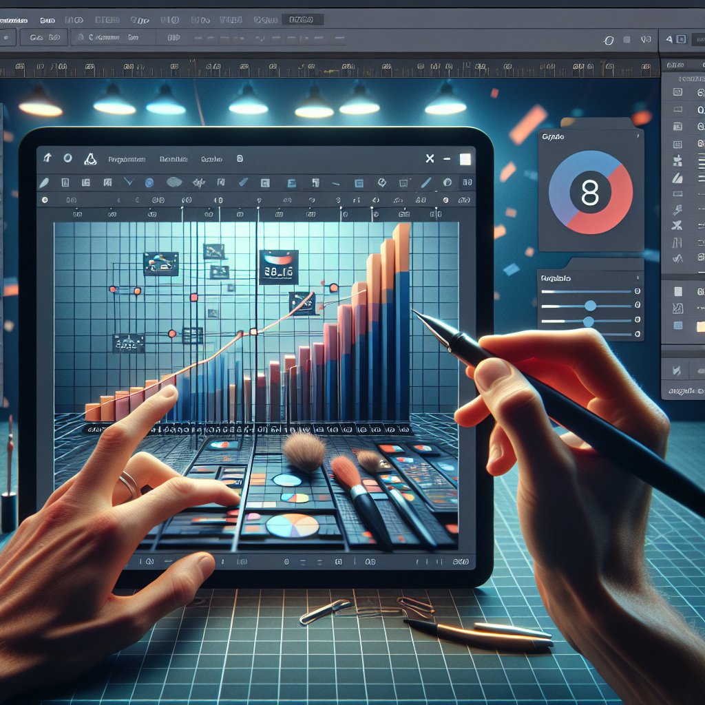
Mastering Bar Graph Editing in Google Sheets
Google Sheets is a powerful tool for data analysis and visualization. Among its many features, the ability to create and edit bar graphs stands out as a particularly useful function for presenting data in a clear and visually appealing manner. Whether you’re a student, a business analyst, or just someone who loves to organize data, mastering the art of editing bar graphs in Google Sheets can elevate your data presentation game. In this article, we’ll dive deep into the nuances of bar graph customization and provide you with the knowledge to tweak your graphs to perfection.
Creating the Foundation: Inserting a Bar Graph
Before we delve into editing, it’s essential to understand how to insert a bar graph in Google Sheets. Here’s a step-by-step guide to get you started:
- Select the range of data you want to include in your bar graph.
- Click on the Insert menu and choose Chart.
- In the Chart Editor that appears on the right, ensure that the Chart Type is set to Bar chart.
Once you’ve inserted a basic bar graph, it’s time to transform it into a compelling visual story.
Customizing Your Bar Graph
Google Sheets offers a plethora of customization options. Let’s explore how to access and utilize these features to make your bar graph stand out.
Accessing Chart Editor Options
To begin editing your bar graph, click on the graph to bring up the Chart Editor sidebar. This sidebar is your control panel for all things related to your chart’s appearance and data.
Adjusting Chart & Axis Titles
A clear title is crucial for any chart. To edit the chart title and axis titles:
- Click on the chart to select it.
- In the Chart Editor, go to the Customize tab.
- Expand the Chart & axis titles section.
- Select which title you want to edit from the dropdown menu and type in your desired text.
You can also adjust the font, size, format, and color to make the titles more impactful.
Modifying Bar Colors and Styles
To make your bar graph more visually appealing, consider changing the colors or styles of the bars:
- Within the Chart Editor, navigate to the Customize tab.
- Click on Series to expand the options.
- Here, you can select individual series (if you have more than one) and change the fill color, border color, and apply styles like gradients.
Adjusting the Bar Width and Spacing
The width and spacing of bars can significantly affect the readability of your graph:
- Still in the Series section of the Chart Editor, look for the Bar width and Bar spacing sliders.
- Drag these sliders to adjust the thickness of the bars and the spacing between them until you find a balance that suits your data.
Organizing Data with Sorting
Sometimes, sorting the bars can provide better insights:
- Click on the three-dot menu on the top right of your chart and select Edit chart.
- In the Setup tab, you can sort the bars by either the axis labels or the values in ascending or descending order.
Advanced Bar Graph Editing Techniques
For those looking to take their bar graphs to the next level, Google Sheets offers advanced editing options.
Adding Data Labels for Clarity
Data labels can provide exact values at a glance:
- In the Series section of the Chart Editor, check the box for Data labels.
- Customize the font, size, and color to ensure they are readable without cluttering your graph.
Implementing Chart Filters
Chart filters allow you to control which data is displayed:
- Click on the three-dot menu and choose Add a filter.
- Choose the range and conditions for your filter to refine the data displayed in your bar graph.
Utilizing Secondary Axis for Comparison
If you’re working with two different data sets, a secondary axis can be helpful:
- In the Chart Editor, under the Series section, select the series you want to assign to the secondary axis.
- Check the box for Secondary axis.
- Customize the secondary axis just like the primary one, ensuring it’s distinct yet complementary.
Interactive Features: Making Your Bar Graph Dynamic
Interactive features can turn a static bar graph into an engaging experience for your audience.
Adding Hover Tooltip Information
Tooltips appear when you hover over a bar, providing additional information:
- In the Chart Editor, go to the Customize tab and select Tooltip.
- Choose what information to display, such as the data point value or both the value and the series name.
Enabling Range Selector for Large Data Sets
For graphs with extensive data, a range selector can improve navigation:
- This feature is more common in line charts but can be enabled in bar graphs through creative use of chart types and settings.
- Consider using a combo chart with a line series to introduce a range selector.
Design Tips for Professional-Looking Bar Graphs
A well-designed bar graph can make a strong impression. Here are some design tips to keep in mind:
- Consistency: Use consistent colors and styles for a cohesive look.
- Contrast: Ensure there is enough contrast between the bars and the background for easy readability.
- Simplicity: Avoid cluttering your graph with too much information. Keep it simple and focused.
Frequently Asked Questions
How do I change the orientation of my bar graph to horizontal?
In the Chart Editor under the Chart type dropdown, select Horizontal bar chart to change the orientation.
Can I add a trendline to my bar graph?
Trendlines are typically used in scatter plots and line charts. However, you can create a combo chart with a line to approximate a trendline for your bar graph data.
Is it possible to animate bar graphs in Google Sheets?
Google Sheets does not currently support animation within charts. However, you can create a series of charts to simulate animation in a presentation.
Conclusion
Editing bar graphs in Google Sheets is a skill that can greatly enhance your data visualization capabilities. By understanding the various customization options available, you can create bar graphs that are not only informative but also aesthetically pleasing. Remember to keep your audience in mind and design your graphs to convey the data story effectively. With practice, you’ll be able to edit bar graphs with confidence and creativity.
Remember, the key to a great bar graph lies in its ability to communicate data clearly and effectively. Use the editing tools at your disposal to highlight the most important aspects of your data and guide your audience through your findings. Happy graphing!

